When Design Can’t See What a Word’s Shape Needs
The Dyslexic Eye Knows Something’s Off
Can you see it? Seeing typically imperceptible “nits” in graphic design has always been somewhat of a party trick of mine. I didn’t know others couldn’t see them, but I’ve learned most can’t. Read on to “see” what I’m talking about.
I’ve spent my entire career in marketing — product marketing, brand, executive-level messaging, all the things that sit between a company and the outside world. And here’s something I didn’t have language for until much later in life:
I can tell when words in a design look “off,” even when I can’t explain why.
A pixel here.
A line break there.
A word that didn’t belong at the end of a sentence because it made the whole thing lose its rhythm.
I wasn’t a designer, I’m still not. But I was always the one pointing at the screen saying, “Right there. Something’s wrong right there.”
My engineers would shrug and tell me design didn’t matter — “If the product’s good, it’ll sell by word of mouth.”
And I’d look at them, fully unamused, and say:
“If quality engineering is our differentiator, why would we send out sloppy marketing? You can’t claim excellence and then hand people visual tension.”
Visual tension — the thing neurotypicals don’t feel because they’re reading phonetically, not by shape. To the dyslexic brain? We feel it like an itch under our skin.
THE PART EVERYONE LEANS IN FOR:
What’s Actually Happening When Something “Feels Off”**
You don’t have to speak designer to understand this part.
In fact, most designers don’t describe it this way — but dyslexic readers and pattern-sensitive brains feel it instantly.
Here’s what’s going on behind that “ugh, no” feeling you get when the text and design aren’t working together.
Visual Rhythm
Every line of text creates a rhythm — a pacing — based on spacing, curves, and how letters sit next to each other.
When that rhythm is uneven, the brain stumbles. It’s like a song where the drummer keeps hesitating.
Weight & Posture of the Font
Fonts have body language.
Some lean forward, some sit upright, some slouch a little.
When the font’s posture doesn’t match the tone of the message (formal words in a casual font, soft sentence in a stiff font), you feel the mismatch even if you can’t name it.
Micro-Rhythm Sensitivity
This is the tiny spacing between letters and the microscopic pattern they create.
Most people don’t notice this.
Dyslexic readers absolutely do — because we rely on pattern consistency to read comfortably.
One slightly cramped letter? The whole line feels wrong.
Letterform Interference
Not all A’s look the same. Not all G’s sit the same way.
When two different fonts with different style rules (e.g., rounded vs sharp) appear together, the mismatched letter shapes interrupt each other — like two keyboards with different key spacing.
Contrast Imbalance
When one font is heavier, darker, or sharper than the text around it, it becomes “visually louder.”
You’re supposed to read the sentence… but your eye keeps getting pulled to the loud kid in the back of the room.
Natural Reading Flow
It helps if the brain can understand the text quickly—at-a-glance, as a whole, not piece by piece.
If line lengths, spacing, or shapes break the flow, your brain keeps resetting — like trying to read a paragraph while someone keeps tapping your shoulder.
Font Tension
This is the subtle irritation that happens when two fonts don’t like each other.
Maybe one is soft and human, the other rigid and mechanical.
Together they create a quiet internal argument your brain keeps trying to solve.
Visual Tension
This includes misalignments, uneven spacing, awkward breaks, or anything that creates discomfort.
Even a single pixel shift can create tension — yes, one pixel.
(And yes, this is the thing your designers swore wasn’t real until you zoomed in.)
“Visually Louder” Elements
Some words pull attention not because they’re important, but because their font weight or posture steals attention.
This disrupts hierarchy — the natural order of what you’re supposed to look at first.
Changes the Reading Rhythm
If a line break forces a strange pause, or a long word gets slapped onto the next line, the rhythm changes — like someone inserted an accidental beat in a sentence.
The meaning doesn’t change, but the experience does.
The Eye Expects Reliable Patterns
Your brain assumes letters and words will follow predictable patterns — shape, spacing, movement left to right.
When a pattern breaks unexpectedly, the brain reflexively halts.
(Not consciously — this is happening under the hood.)
Word Silhouettes
Dyslexic readers process text by shape.
Every word has a silhouette — tall/short letters, curves, ascenders, descenders.
If the font distorts that silhouette or makes shapes too similar, reading becomes work.
Font Energy Mismatch
Every font has an “energy”:
warm, corporate, soft, strict, playful, academic.
Put mismatched energies together and your text becomes emotionally inconsistent.
It feels like two people telling one story with different personalities.
Why This Matters (The Vindication Moment)
Once you finally have the vocabulary —
visual rhythm, font tension, micro-rhythm, letterform interference —
it’s like someone handed you a flashlight for a room you’ve been sitting in your whole life.
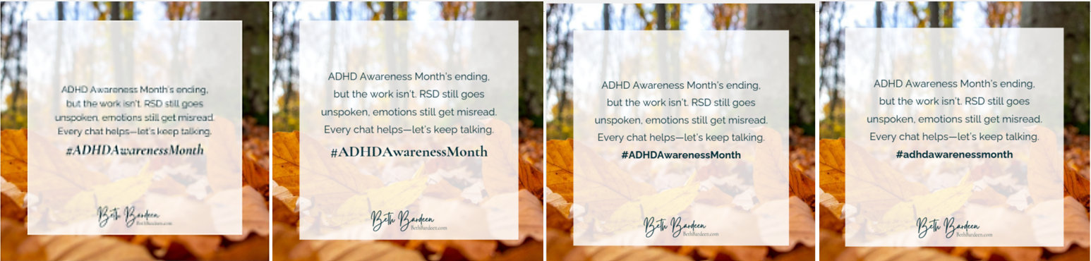
Within a week, you saw IngramSpark’s publishing guide mention managed copy and you thought, “Well, there it is.”
Within days, you noticed the visual tension in your ADHD Awareness designs and understood why your brain kept protesting.
This center section gives readers the same thing you finally got:
language for what their brain already knows.
If you want, I can now weave this section seamlessly into the full blog article, or create a visual glossary for social media to pair with it.
Word Shapes Are Part of the Design (Even If Most People Never Notice)
People who read phonetically look at letters.
Dyslexic readers look at shapes — the silhouettes, the rhythm, the way a word takes up space.
A word isn’t a sequence of letters.
It’s a shape that can do a better job with the right environment.
Fonts, spacing and line breaks change the shape of a word. If a font is stiff or the spacing too tight or there’s an extra pixel throwing off alignment, the whole shape can change the feeling of a word. And my brain immediately flags it. I don’t need to know the technical term — my nervous system just says, “Nope, that’s not right, let’s fix it.”
Designers couldn’t see it.
“The spacing is fine.”
“It’s all aligned.”
“It’s balanced.”
“I’m not seeing it.”
And then we’d zoom in.
And there it was:
One line nudged two pixels too far to the left.
A letterform that didn’t belong with the others.
A line ending with a visual speed bump that slows the reader down.
They couldn’t see it.
But when they finally saw it — their eyes would widen.
Like, How did you SEE that?
My brain doesn’t skim.
My brain scans patterns.
And when the pattern is off, I feel it before I understand it.
I Became the Copy Editor Nobody Expected
Over the years, teams learned something:
You couldn’t train yourself to see what I saw.
But you could trust me when I said something was off.
I’d rewrite the text—longer words, shorter words, different shaped words–just to move an important word to the end of a line — because the shape of the last word determines how the entire message lands.
I’d close tiny gaps.
Shift headers by a hair.
Question designs that “felt off,” even when I didn’t have the vocabulary for what the design software called it.
And every time I pushed back, someone would eventually say,
“Okay… wow… I see it now.”
Why This Matters (Even If You’re Not in Marketing)
This isn’t about kerning or style or fonts.
It’s about a reader’s experience.
Our brains already have enough to do. If the words’ design slows us down — if the shapes don’t make sense with the design — your brain won’t take in the message as easily. You might not know why you’re irritated… but you’ll feel it.
Neurotypicals can sound out letters as needed.
Dyslexic readers?
We read by shape first. It doesn’t mean we didn’t learn to sound out words, it means our native reading default is by shape. And if a design doesn’t support a word’s shape, the meaning becomes harder to grasp.
This isn’t preference.
It’s neuroscience.
And it affects everyone — not just dyslexic readers — even if only some of us notice it viscerally.
If You’ve Ever Felt “Something’s Off” Without Words for Why… You’re right.
That sensation is real.
Word shapes need the right kind of space.
They need a font that holds them right, and flows.
They need a rhythm the eye can follow without stumbling.
They need design that supports them instead of fighting them.
Most people won’t notice the misalignment.
But the dyslexic eye does.
The AuDHD brain does.
The marketer who’s spent a lifetime feeling the tension between a message and its meaning does.
And honestly?
We’re not being picky.
We’re protecting the reader and the message.
About the Author
Hey there! I'm Beth, a neurodiversity advocate and consultant here to help smooth the path of your ADHD journey.
The Latest in 'Ask Beth'
I’ve always gone out of my way to make others happy. I usually offer help and don’t wait for them to ask.

I’m in my late 40s and struggling with a new ADHD diagnosis. I’ve been messy and late most of my life, but I’ve also worked hard to make it up to everyone. Lately it seems I can’t get back on track no matter how hard I try, and it’s stressing me out.
No results available